Streamlit, a framework that lets datascients' life more beautiful
Imagine that a data scientist got datasets, he worked a lot standardizing, normalizing, and cleaning invalid values. He also needed to get insights and to figure out if there was some behavior. To do this, he plotted some charts, he calculated the averages and other repetitive chores. Afterward he got updated datasets and he needed to repeat all tasks.

Now, imagine the data scientist working with a flexible, simple and easy to deploy tool that allows manipulation of data to do recurring tasks of the day and this one was built for himself.

If this data scientist uses Streamlit, it is possible. According to the site, the definition for the Streamlit is:
a minimal framework for powerful apps.
It was built to use with Python, to create nice interfaces and put it on the web without worrying with a complex backend development.
My purpose with this post is to create a very simple application where someone can make an exploratory data analysis and the same time, I wanna show you how easy is the Streamlit. With this application, you will make an upload file, also you will see some rows statistics and finally you will be able to plot charts (histogram, scatter and box).
So, let ‘s do this!!!

Firstly, we need to run the Streamlit. To do this, I like do use Docker, so we are going to create some files: requirements.txt, Dockerfile, docker-compose.yml and app.py.
requirements.txt
numpy
pandas
matplotlib
streamlit
Dockerfile
FROM python:3.8-slim-buster
MAINTAINER Fernando Mariano <fernando.mar16@gmail.com>
RUN mkdir /app

COPY . /app

RUN pip install --upgrade pip
RUN pip install -r /app/requirements.txt

ENV GIT_PYTHON_REFRESH="quiet"
WORKDIR /app
docker-compose.yml
version: '3.7'

services:
    app:
        build: .
        container_name: streamlit_app
        command: streamlit run app.py
        volumes:
            - .:/app
        ports:
            - "8501:8501"
app.py
def main():
    # Yeah!!! The Streamlit allows us to use markdown :)
    st.markdown("# Data exploratory application")


if __name__ == '__main__':
    main()
Now, carry out docker-compose up on the terminal, wait until it finishes the process, open your browser and access http://localhost:8051. If previous steps were right, you will see:

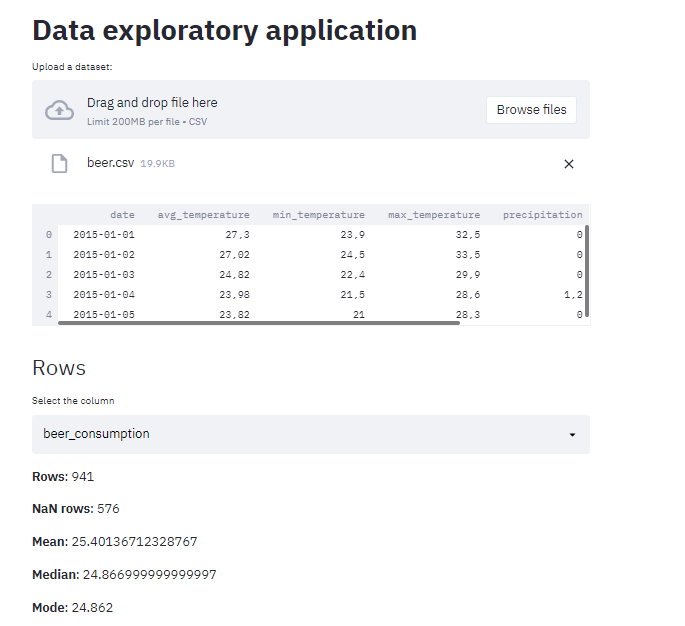
The next step will be to insert a field to upload a dataset, read it, and show some statistics about the rows.
def main():
    # Yeah!!! The Streamlit allows to use markdown :)
    st.markdown("# Data exploratory application")

    # Field to upload only files with extension .csv
    file = st.file_uploader("Upload a dataset:", type=['csv'])

    if file:
        # if worked out, then it one is read and showed on a table
        data = pd.read_csv(file)
        st.dataframe(data.head())

        # Put a subtitle
        st.markdown("## Rows")

        # It shows the total rows of a dataset
        st.markdown(f"__Rows__: {len(data)}")

        # Field to select a column
        column = st.selectbox("Select the column", data.columns)

        # if a column was choose, some statistics about this is showed
        if column:
            st.markdown(f"__NaN rows__: {data[column].isna().sum()}")
            st.markdown(f"__Mean__: {data[column].mean()}")
            st.markdown(f"__Median__: {data[column].median()}")
            st.markdown(f"__Mode__: {data[column].mode()[0] }")
After the changes, I sent the same dataset that I wrote about in this post to do a test.

Our little project is getting nice! Now, we are going to put the charts!
# Put a subtitle
st.markdown("## Charts")

# Chart options
options = ['Histogram', 'Scatter', 'Box']
chart = st.radio('Choose a chart', options)

# Hide some warnings
st.set_option('deprecation.showPyplotGlobalUse', False)

if chart == 'Histogram':
    # if choose this, a column list is showed
    column = st.selectbox("Select a column", data.columns)
    # After the user select one, the chart is displayed
    plt.hist(data[column].values)
    st.pyplot()


if chart == 'Scatter':
    # As you must know, the scatter is good to correlations
    # that's why we have to fields to select columns
    x = st.selectbox("Select the X axis", data.columns)
    y = st.selectbox("Select the Y axis", data.columns)

    if x and y:
        # when the columns have values we prepare
        # the values and put on the chart
        x = data[x].values
        x = x.reshape(-1, 1)
        plt.scatter(x, data[y].values)
        st.pyplot()

if chart == 'Box':
    # Field to select multiple columns
    columns = st.multiselect("Select the columns", data.columns)
    if len(columns) > 0:
        # Is there any column selected? Then the chart is plotted
        data.boxplot(column=columns)
        st.pyplot()
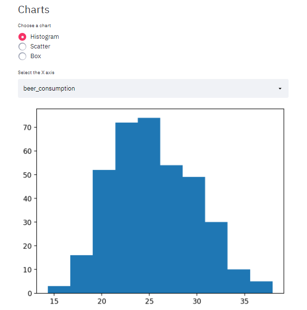
It’s time to see the results!
Histrogram

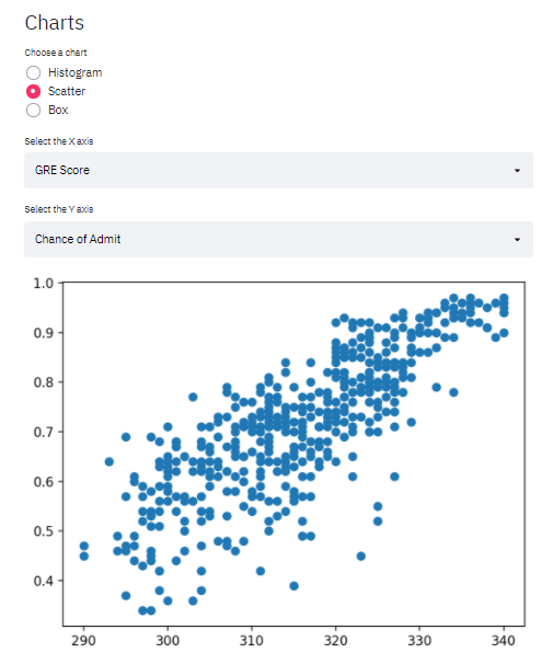
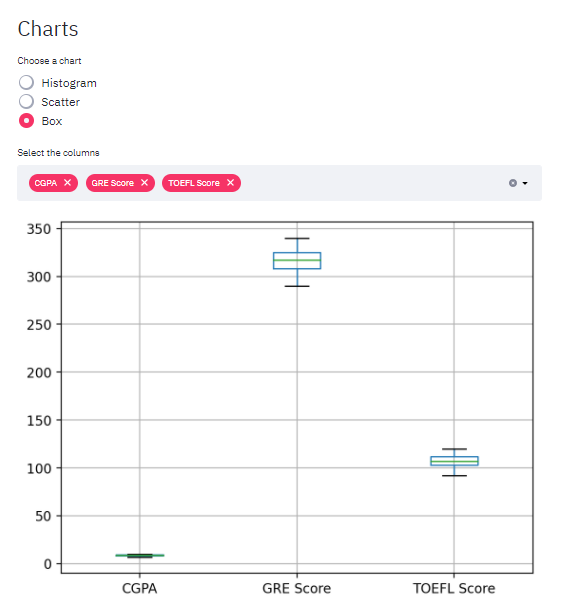
To exemplify Scatter and Box charts, I got the dataset that was used on the Multiple Linear Regression’s post.
Scatter

Box

As I said in the beginning, my goal with this article was to show how to create a simple application that can help datascients. I did not care about Python code patterns, I only built it. Of course, this example can be better, so feel free to comment whether you liked it or not.
The whole code from this post is here
Streamlit
datascients
exploratory analysis
Python
Discussion and feedback