Simple Linear Regression
Today I’m going to talk about my studies with Linear Regression and show a simple example. For this content, I searched on Kaggle and found the Beer Consumption - Sao Paulo dataset. As the name says, this one owns data about beer consumption and on this post, I’m going to find out what information helps to vary the consumption.
Firstly, I imported the libs and the dataset to visualize the columns.
import pandas as pd
import matplotlib.pyplot as plt
import seaborn as sns
from sklearn.linear_model import LinearRegression

base = pd.read_csv('dataset.csv')
base.head()

After this, I perceived that there was a lot of empty lines.
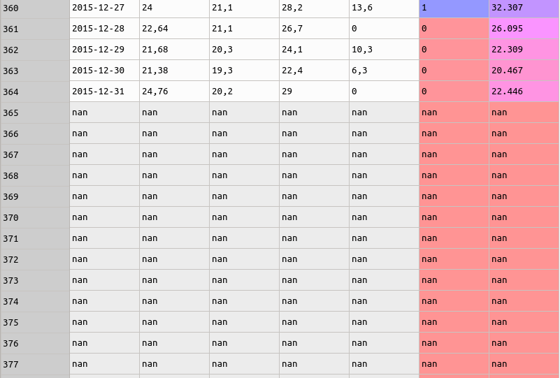
To be exact, on the dataset there were 576 empty lines. To know how much registers were NaN, I executed the code below.
base.isna().sum()
And I got the following table.
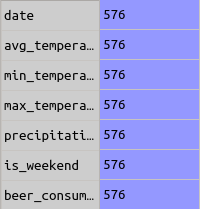
After raising the information above, I needed to clean useless lines. To do this I executed:
base = base.dropna()
So, before I find a variable that I used to correlate with beer_consumption I needed to see whether the data was normalized. For this, I plotted a histogram graph.
# get the last column values (beer_consumption)
consumption = base.iloc[:, -1].values
plt.hist(consumption)
The code above showed the following graph:
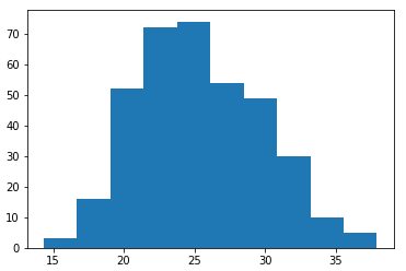
In the chart, I saw that the data was normalized and with this precondition, I would want to know which variable to correlate, to understand and to predict the beer consumption. For that, I generate a heatmap and I could see which variable had the strongest relation.
But before to plot the chart, I need to convert the variables, because they imported as string types.
# replace comma by the dot and convert the values
base['avg_temperature'] = base['avg_temperature'].str.replace(',', '.')
base['avg_temperature'] = base['avg_temperature'].astype(float)

base['min_temperature'] = base['min_temperature'].str.replace(',', '.')
base['min_temperature'] = base['min_temperature'].astype(float)

base['max_temperature'] = base['max_temperature'].str.replace(',', '.')
base['max_temperature'] = base['max_temperature'].astype(float)

base['min_temperature'] = base['min_temperature'].str.replace(',', '.')
base['min_temperature'] = base['min_temperature'].astype(float)

base['precipitation'] = base['precipitation'].str.replace(',', '.')
base['precipitation'] = base['precipitation'].astype(float)

base['is_weekend'] = base['is_weekend'].astype(bool)
To generate the heatmap I used the Seaborn library.
sns.heatmap(base.corr(), annot=True)
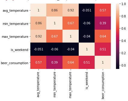
With the heatmap image, I could see that better relation with beer_consumption was max_temperature. The strong this correlation was 0.64 and it had a modered level.
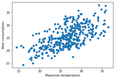
The next steps were to understand the behavior between both variables through the scatter chart.
# values to X axis
x = base['max_temperature'].values
x = x.reshape(-1, 1)
# values to Y axis
y = base['beer_consumption'].values
plt.scatter(x, y)
The chart showed me that according max_temperature grows, also grows the beer_consumption.
Before to predict the beer_consumption, I needed to train the data.
model = LinearRegression()
model.fit(x, y)
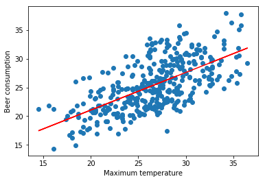
With data trained, I showed a line to values that were predicted.
To finish, another experience is to try to predict a single value. As e.g, I’m going to predict a beer_consumption with a max_temperature of 38 degrees celsius.
model.predict(38)
# Output: array([ 32.85907157])
In other words, with a max_temperature of 38 degrees Celcius, the beer_consumption would be 32 liters.
I hope you have liked this post. Any doubt or suggestions is only to write a comment.
data science
python
linear regression
statistic
Discussion and feedback